반응형
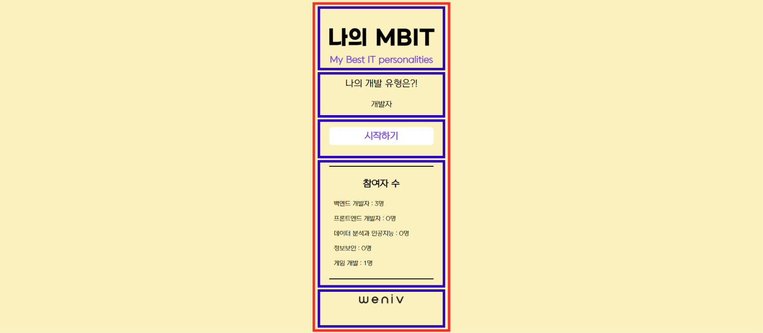
메인 페이지를 위의 이미지와 같이 큰 컨테이너 하나에 <div> 5개로 나눈다.

animation 속성과 @keyframes 규칙 사용한다.
index.html
<!DOCTYPE html>
<html lang="en">
<head>
    <meta charset="UTF-8">
    <meta http-equiv="X-UA-Compatible" content="IE=edge">
    <meta name="viewport" content="width=device-width, initial-scale=1.0">
    <title>나의 개발 유형 찾기</title>
    <link rel="stylesheet" tyle="text/css" href="css/reset.css">
    <link rel="stylesheet" tyle="text/css" href="css/style.css">
</head>
<body>
    <section id="main_contents">
        <div class="wrapper">
            <div class="title">
                <h3 class="main_title">나의 MBIT</h3>
                <h3 class="sub_title">My Best IT personalities</h3>
            </div>
            <div class="intro">
                <h1>나의 개발 유형은?!</h1>
                <div class="type">
                    <ul class="type_list">
                        <li>개발자</li>
                        <li>데이터 분석과 인공지능</li>
                        <li>정보보안</li>
                        <li>게임 개발</li>
                        <li>개발자</li>
                    </ul>
                </div>
            </div>
            <div class="button">
                <a href="#">
                    <button class="start" type="button">시작하기</button>
                </a>
            </div>
            <div class="result_data">
                <div class="data_wrap">
                    <h3>참여자 수</h3>
                    <ul>
                        <li>백엔드 개발자 : 0명</li>
                        <li>프론트엔드 개발자 : 0명</li>
                        <li>데이터 분석과 인공지능 : 0명</li>
                        <li>정보보안 : 0명</li>
                        <li>게임 개발 : 0명</li>
                    </ul>
                </div>
            </div>
            <div class="weniv">
                <a href="http://www.paullab.co.kr">
                    <img src="img/weniv_logo_black.png" alt="weniv">
                </a>
            </div>
        </div>
    </section>
</body>
</html>
style.css
@font-face {
    font-family: 'GmarketSansBold';
    src: url('https://cdn.jsdelivr.net/gh/projectnoonnu/noonfonts_2001@1.1/GmarketSansBold.woff') format('woff');
    font-weight: normal;
    font-style: normal;
}

@font-face {
    font-family: 'NEXON Lv1 Gothic OTF';
    src: url('https://cdn.jsdelivr.net/gh/projectnoonnu/noonfonts_20-04@2.1/NEXON Lv1 Gothic OTF.woff') format('woff');
    font-weight: normal;
    font-style: normal;
}

@keyframes rotate {
    0% {
        transform: translateY(0);
    }
    25% {
        transform: translateY(-20%);
    }
    50% {
        transform: translateY(-40%);
    }
    75% {
        transform: translateY(-60%);
    }
    100% {
        transform: translateY(-80%);
    }
}

html {
    width : 100%;
    height: 100%;
}

body {
    width : 100%;
    height: 100%;
    background-color: #faf1be;
    color: #000;
    font-family: "NEXON Lv1 Gothic OTF";
}

#main_contents {
    display: flex;
    justify-content: center;
    width: 100%;
    height: 100%;
    margin-top: 100px;
}

#main_contents .wrapper {
    display: flex;
    flex-direction: column;
    width: 100%;
    height: 100%;
    max-width: 500px;
}

.title {
    text-align: center;
    padding-bottom: 50px;
}

.main_title {
    font-family: "GmarketSansBold";
    font-size: 50px;
    padding-bottom: 15px;
}

.sub_title {
    font-size: 20px;
    font-weight: bold;
    color: #7F47DD;
}

.intro {
    text-align: center;
    padding-bottom: 40px;
}

.intro h1 {
    font-size: 30px;
    padding-bottom: 15px;
}

.type {
    font-size: 25px;
    line-height: 3em;
    height: 3em;
    overflow: hidden;
}

.type_list{
    animation : rotate 7s infinite;
}

.button {
    text-align: center;
    padding-bottom: 50px;
}

.button button {
    width : 300px;
    height: 50px;
    padding: 5px;
    border-style: none;
    border-radius: 10px;
    font-family: "NEXON Lv1 Gothic OTF";
    font-size: 20px;
    font-weight: bold;
    background-color: #fff;
    color: #7F47DD;
    cursor: pointer;
    margin-bottom: 20px;
}

.button button:hover {
    text-decoration: underline;
}

.result_data {
    display: flex;
    justify-content: center;

}

.result_data .data_wrap {
    width: 270px;
    padding: 15px;
    border-top: 3px solid #000;
    border-bottom: 3px solid #000;
    line-height: 1.5;
    margin-bottom: 50px;
}

.result_data h3 {
    text-align: center;
    font-size: 20px;
    font-weight: bold;
    padding: 20px 0 30px;
}

.result_data li {
    font-size: 15px;
    padding-bottom: 10px;
}

.weniv {
    display: flex;
    justify-content: center;
    padding-bottom: 50px;
}

.weniv a {
    width: 100px;
}

.weniv img {
    width: 100%;
    height: auto;
}
본 내용은 inflearn의 'MBTI' 강의를 참고하여 작성한 내용입니다.
반응형
'CodeSiri > Project' 카테고리의 다른 글
| [MBTI👀] FE03. 결과 페이지 만들기 (0) | 2021.07.14 |
|---|---|
| [MBTI👀] FE02. 설문 페이지 만들기 (0) | 2021.07.13 |
| [Googoos🕊] 05. Spring | 회원 관리자 페이지 - 회원 권한 관리 & 회고 | MyBatis, SpringMVC (0) | 2021.06.12 |
| [Googoos🕊] 04. Spring | 회원가입 중복체크 | ajax, MyBatis (0) | 2021.06.11 |
| [Googoos🕊] 03. Spring | login Session & Join (0) | 2021.05.26 |